Before Image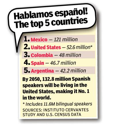 After Image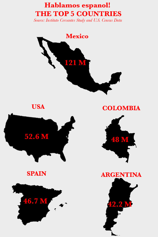
Visualization - Depicting NumbersThe original image provides a clear and simple depiction of statistical data but it does not single out any specific number nor does it tell a story. Although the numbers are listed in order from greatest to least in the original image it does not emphasize the importance of the numbers or it's relevance to a novice Spanish speaker. In the past, I have used the original image during the first few days of Spanish 1 to help students understand how many people speak Spanish in the United States and Mexico. We then discuss how learning Spanish can impact their future. I changed the image in an attempt to help students better "see" the data.
To help viewers visualize the data I placed the number of Spanish speakers inside an outline of each country. I hope that by providing viewers with the country outline they can better "see" the number of Spanish speakers in each country. I also emphasized the number by contrasting the color and slightly increasing the size. In addition, I arranged the data from greatest to least in order to show that Mexico has the most number of Spanish speakers followed by the countries placed below. The purpose of the image is to show learners that there are more Spanish speakers in Mexico and the United States than anywhere else in the world. By arranging the images and numbers in sequential order I was able to highlight these numbers and clearly portray the purpose. Next, I made the background gray in order to create additional contrast and draw attention to the countries and numbers. Finally, I made sure the numbers and labels were clear and consistent.
0 Comments
Before Image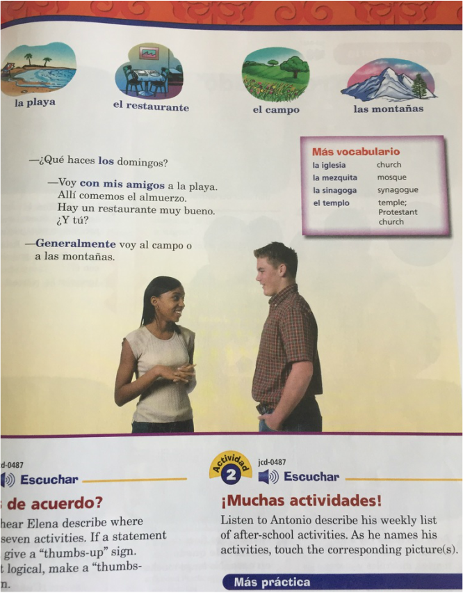 After Image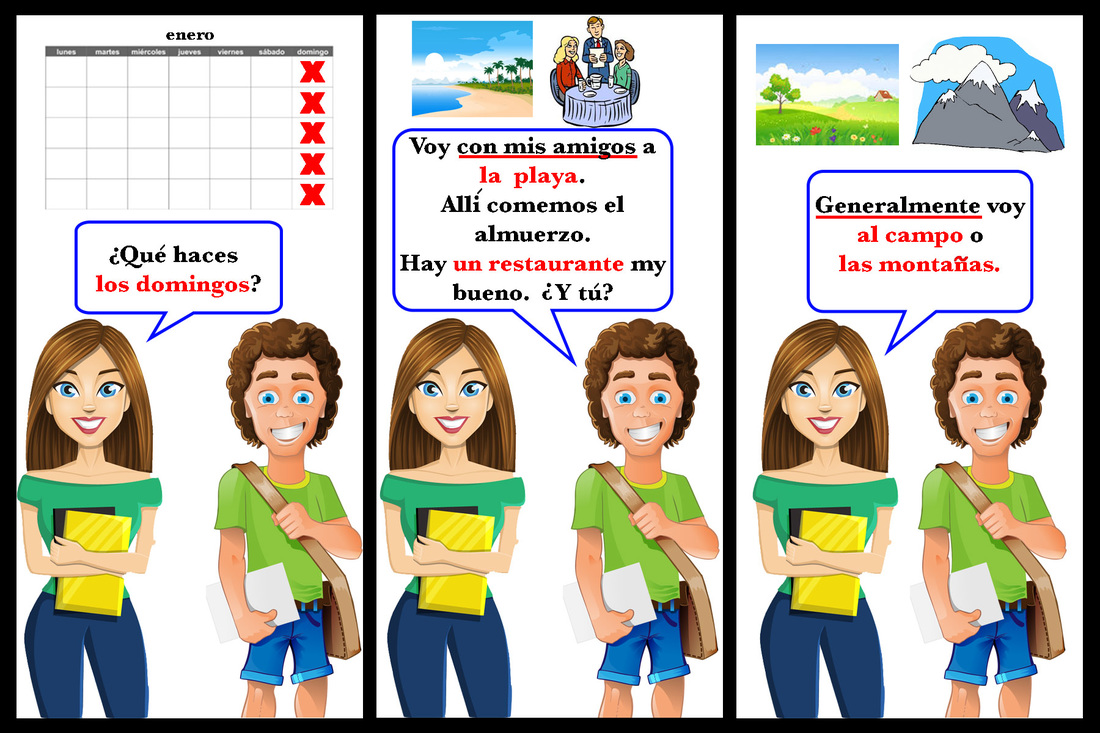
Storytelling: Telling Stories with VisualsThe original image is from the textbook series "Realidades." It appears that the aim of the text and images are to tell a story but due to the placement of both the images and text it is difficult to tell who is talking and what they are talking about. The original images alerts the viewer to key vocabulary in two ways. It highlights essential text and provides an image with some of the vocabulary words. I assumed that since the girl is on the left that she is speaking first.
In order to improve the image through story telling I added text bubbles, panels, gutters, realistic illustrations and images. Similar to the original image I also highlighted and underlined key text. The original image suggests that the conversation is taking place between two students. I chose two realistic illustrations to represent high school age students. I created a separate panel for each section of the conversation. This will allow the viewer to focus on one panel at a time and view the story from left to right. I also placed small gutters between each panel to indicate the conversation moves at a normal pace. In order to convey that the two characters are talking I chose a text bubble with a solid line. Finally, in an attempt to draw attention to the key terms I highlighted the text in two ways. If the word or phrase could be easily viewed as an image I placed that image above the text box. If the word or phrase did not easily lend itself to an image I underlined it. Highlighting the key terms should help novice language learners visualize the story of the original text. Note: Below is the English the translation: Girl: What do you do on Sundays? Boy: I go with my friends to the beach. There we eat lunch. There is a good restaurant. And you? Girl: Generally, I go to the countryside or the mountains. Before Image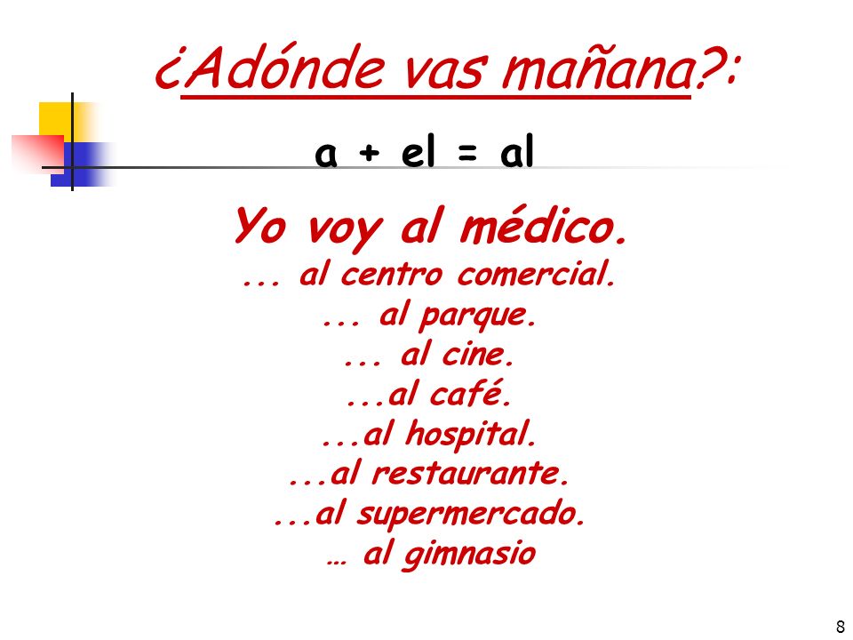 After Image
Adding More MeaningThe original image poses the question in Spanish, "Where are you going tomorrow?" The original image is direct and to the point but doesn't provide the viewer with any idea of what the question is asking or what the responses mean. The meaning of the question could be lost to many learners especially low-level learners.
To enhance the original image I added graphics, a table, and provided sequencing. Below the question, in the original image is a list different places one may go. To enhance the meaning of the original image I replaced each of the places listed with a graphic to represent each one. The images chosen are common symbols for the places they represent and should be easily recognizable by the viewer. Also, the question asks, where are you going tomorrow? To help the viewer better visualize the idea of "tomorrow" I placed the images in a weekly calendar. Although a calendar is not necessarily a timeline, it allowed me to sequence the events. Viewers should be able to easily identify "tomorrow" and given a specific day of the week determine where they are going tomorrow. By placing the images in a calendar I was also able to improve the format. The calendar allowed me to group the places within each day of the week which should help the viewer to focus on one day at a time. Before Image After Image
ExcitementThe original image fails to provide any excitement to the viewer. The image provides a list of words to the right of the image and most of these same words appear close to the people in the image. Although this design may be agreeable to the viewer it is not exciting. In an effort to reduce cognitive load and ensure that the viewers focus was not split between the image and the text I added text bubbles to each person. The image is describing various members within a family so I added text bubbles that explain their relationship to Miguel. Miguel's box says "I am Miguel" in Spanish. I also color coded the text so the viewer can easily recognize the difference between male and female nouns. The male nouns are in blue and female nouns are in red. In addition, I wanted to enhance the communication with my viewer by adding texture. To do so, I first added a frame around the family and then created a "brick wall" behind the frame. In doing so I hope to create the illusion that the image is that of a family photo hanging on a wall.
Before Image After Image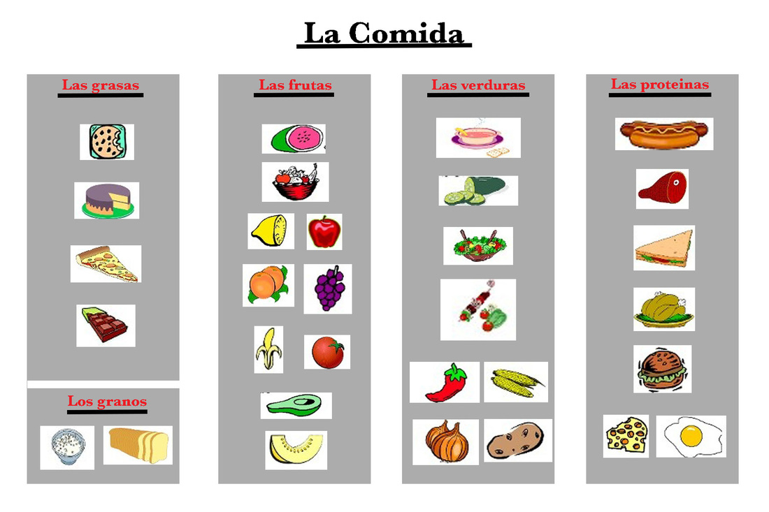
GroupingThe original image presents numerous images of food but they are placed rather haphazardly without any specific design principle in mind. Grouping images allows the learner to make connections between images and thus leads to greater recall. I chose to focus on the design principles of proximity and similarity. First, I created different sections for different types of food (fats, grains, fruits, vegetables, and proteins). I labeled each section with the appropriate title and then placed each image in the appropriate section. By doing so, learners will be able to make connections between the images and the food category. This also allowed me to place the images close together thus applying the design principle of proximity. Finally, by grouping the food into specific categories it should reduce the cognitive load of the learner. The learner will now be able to easily identify the food and the category it belongs to.
Note: Again, I wanted to make something I could use in my classroom so I changed the language from English to Spanish. This will allow me to easily use this image in my classroom. Before Image After Image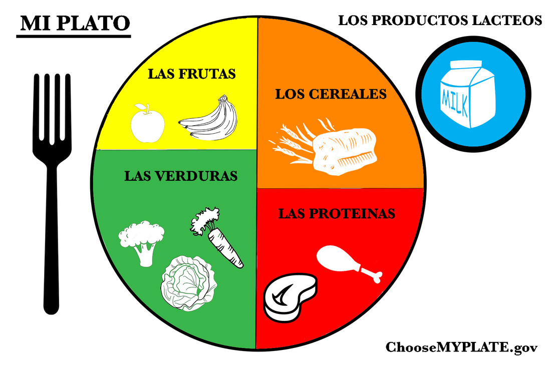
ContrastWhen viewing an image contrast allows one to see the differences between objects. The stronger the contrast the bigger impact it will have. The original image lacked any contrast and quite frankly was rather dull and boring . In the after image I chose to show contrast through color. First, I added color to each section of the food plate. I chose bright and vibrant colors that could represent each respective food category. The intent was that each color would help the viewer make a connection between the category and the type of food. For example, the vegetable category is green and the meat category is red. I also chose to add specific examples within each section. In order to contrast the color again the food images were added in white. This allowed me to apply the concept of contrasting light and dark colors.
Note: I wanted to create something that I could use in my classroom so I changed the language on the original image to Spanish. This will allow me to use the after image with my students. Before Image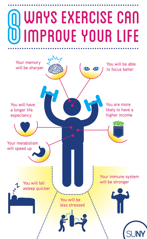 After Image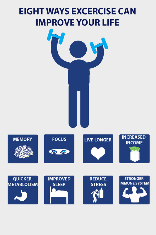
Visual UnityIn order for an image to be unified all elements must share a common theme. Each element and aspect of the visual presentation must have elements in common that represent the overall idea and message (Malamed 174). The original design was visually overwhelming and somewhat misleading. The original design lists eight ways to improve one's health. One would assume that each of these benefits is equal to the other but the size and the placement of the images tells a different story. The three images at the bottom are slighter bigger than the others which makes one believe these are more important. These images are also highlighted with a yellow background which again makes one think they are superior to the others. In an effort to unify the image, I created eight equal boxes which included a visual and short text. This allowed me to apply the idea of repetition. I used the same color scheme, typography and shape to present all information. I also placed each box in a grid to ensure that there was a unified layout.
Before Image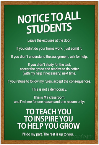 After Image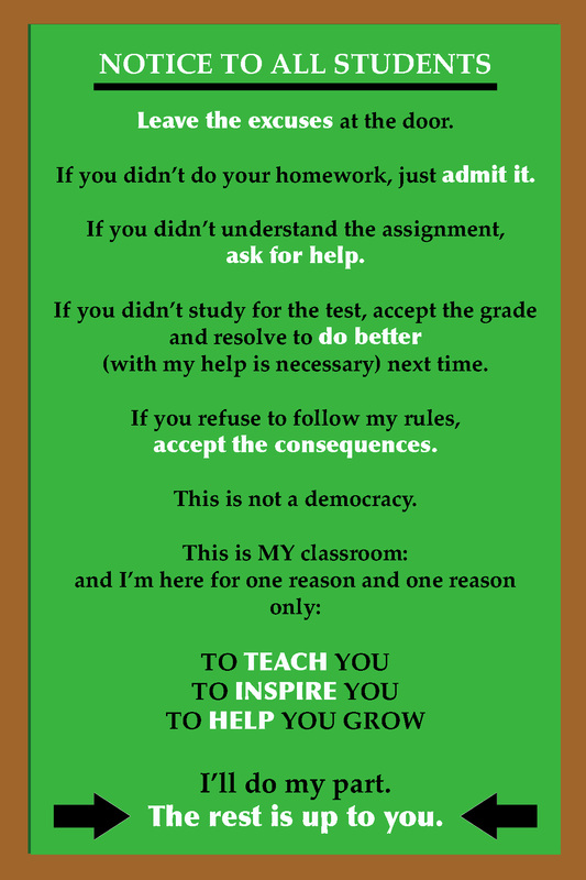
Visual Cue
The original image is clean and neat but it does not highlight the key points. It does not cue the reader to the most essential elements. I chose to use typographical cues to highlight keys words and phrases. I focused on the actions that students could take in the classroom to ensure they were successful. In an effort to bring attention to the identified words and phrases I changed the font type to a bolder font and changed the color to white. I chose white because there is a significant contrast between the green background color and the white text. I also increased the size of the last sentence as I felt if was most important. Finally, I placed arrows on either side of the last sentence. As teachers we do our part to ensure the success of all students every day but until students decide to take responsibility for their own learning and their own success in our classrooms our efforts will be null and void. The arrows allowed me to highlight and emphasize the last sentence. Before Image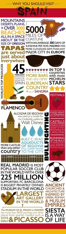 After Image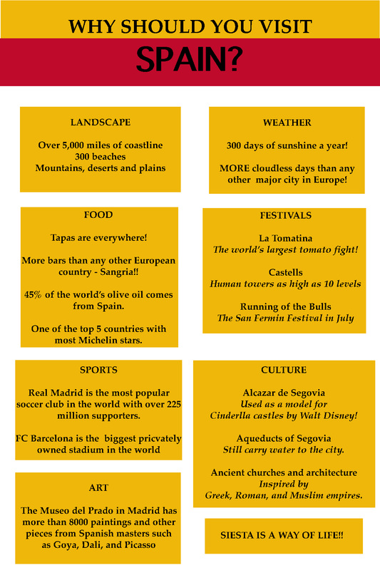
Visual Hierarchy
The original image is colorful with eye catching images but there is no clear pattern or hierarchy. The image is overwhelming and it's difficult to decide where to start or what to read. The purpose of the original image is to explain why one should visit Spain but, due to the original design it is difficult to find the answer. In an attempt to improve the visual hierarchy and to create an image that was easy to view and read. I created separate text boxes for like information. At the beginning of each text box is a short word or heading. This allows the reader to quickly glance at the image and scan for the key term of each box. Also, by creating the text boxes the reader can easily read in an F-pattern from left to right. Before Image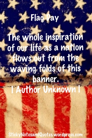 After Image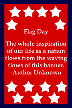
The original image violates several design principles in regards to color. The background color in the original image is darker than the text making it difficult to read the text. The contrast between the background and the typeface is not drastic enough which in turn makes it difficult to read. In addition, the saturation and value of the background color make it difficult to the see the text. Finally, the saturation in the background colors are not bright and vivid.
To recreate the image I used the eye dropper to select the same red and blue shades from the original image. The image is portraying a message about the American flag. I chose to select my palette based on my audience and symbolism. The quote refers to the American flag so I chose to use the colors associated with the American flag as well as add white stars which are a symbol on the American flag. Without reading the message the audience should be able to deduce that the image has a patriotic relevance due to the colors chosen. |
Archives
April 2016
Categories |
||||||||||||||||||||
 RSS Feed
