User Experience Design Mockup
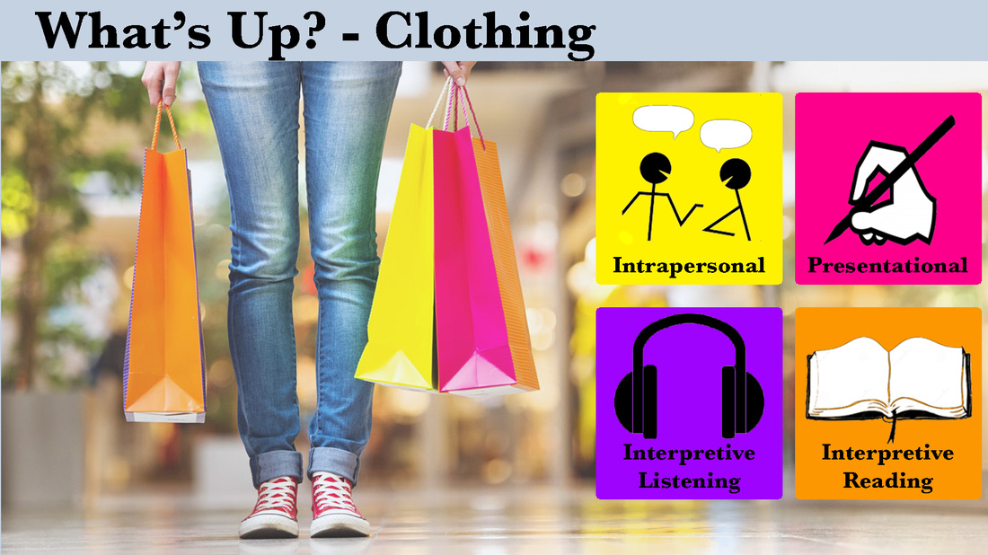
This instructional design mockup was created for the first unit of Spanish 2. The unit is titled, "What's Up?" and discusses clothing and modern trends. This mockup focuses specifically on the clothing portion of the unit. The second language curriculum assesses students in three areas. These areas are interpersonal (the ability to converse with others), presentational (the ability to present information verbally and in writing), and interpretive (the ability to interpret both spoken and written text). This module was designed to provide students an opportunity to engage in a learning object from each these assessment types with the exception of presentational speaking. All Spanish 2 students should be familiar with the names of these assessments and what they entail since they were also used in Spanish 1. The graphics in each box will also provide students with a visual reminder of what each activity entails. Students will be able to control the instruction using an onmouseover control. As they hover over each colored square it will become clickable. Once they click the square it will take them to a screen with the learning objects for that category.
Various CRAP principles were applied in this design. The font in the title and each of the tiles contrasts all background colors. The graphic in each tile was also chosen to contrast the background. The same font is used throughout the mockup to ensure repetition. In addition, the colors in each tile were selected due to the colors found on the shopping bags. If you look closely, there is purple on the side of the orange bag. The tiles are aligned with each other both vertically and horizontally. The text and graphics within each tile are centered and aligned to the surrounding text and graphics. Also, the last letter of the title is aligned with the left edge of the first tile. Finally, the text appears within each tile to ensure that the learner connects the correct graphic is the appropriate text.
Various CRAP principles were applied in this design. The font in the title and each of the tiles contrasts all background colors. The graphic in each tile was also chosen to contrast the background. The same font is used throughout the mockup to ensure repetition. In addition, the colors in each tile were selected due to the colors found on the shopping bags. If you look closely, there is purple on the side of the orange bag. The tiles are aligned with each other both vertically and horizontally. The text and graphics within each tile are centered and aligned to the surrounding text and graphics. Also, the last letter of the title is aligned with the left edge of the first tile. Finally, the text appears within each tile to ensure that the learner connects the correct graphic is the appropriate text.